My client was Cox Communications, one of the country’s largest Internet, phone, cable TV and home automation service providers.
— PROJECT NAME
Cox Communications website revamp
— WHAT I DID
UI copywriting
Brand style guide adherence
Collaboration with UX designers
— TOOLS
Figma
Microsoft Word
Microsoft Teams
— DATE
October 2020 – January 2021
While working for advertising agency FCB Chicago, my client was Cox Communications, a major national telecommunications company.
CHALLENGE: As Cox wanted to promote their new products/campaigns to its customers, I was tasked with writing new copy and streamlining their website's UX to advertise their services and help customers troubleshoot.
SOLUTION: I collaborated with my creative team of 15+ UX designers and web developers to follow Cox's brand style guide when writing UI copy to boost online traffic and consumer sales.
The work.
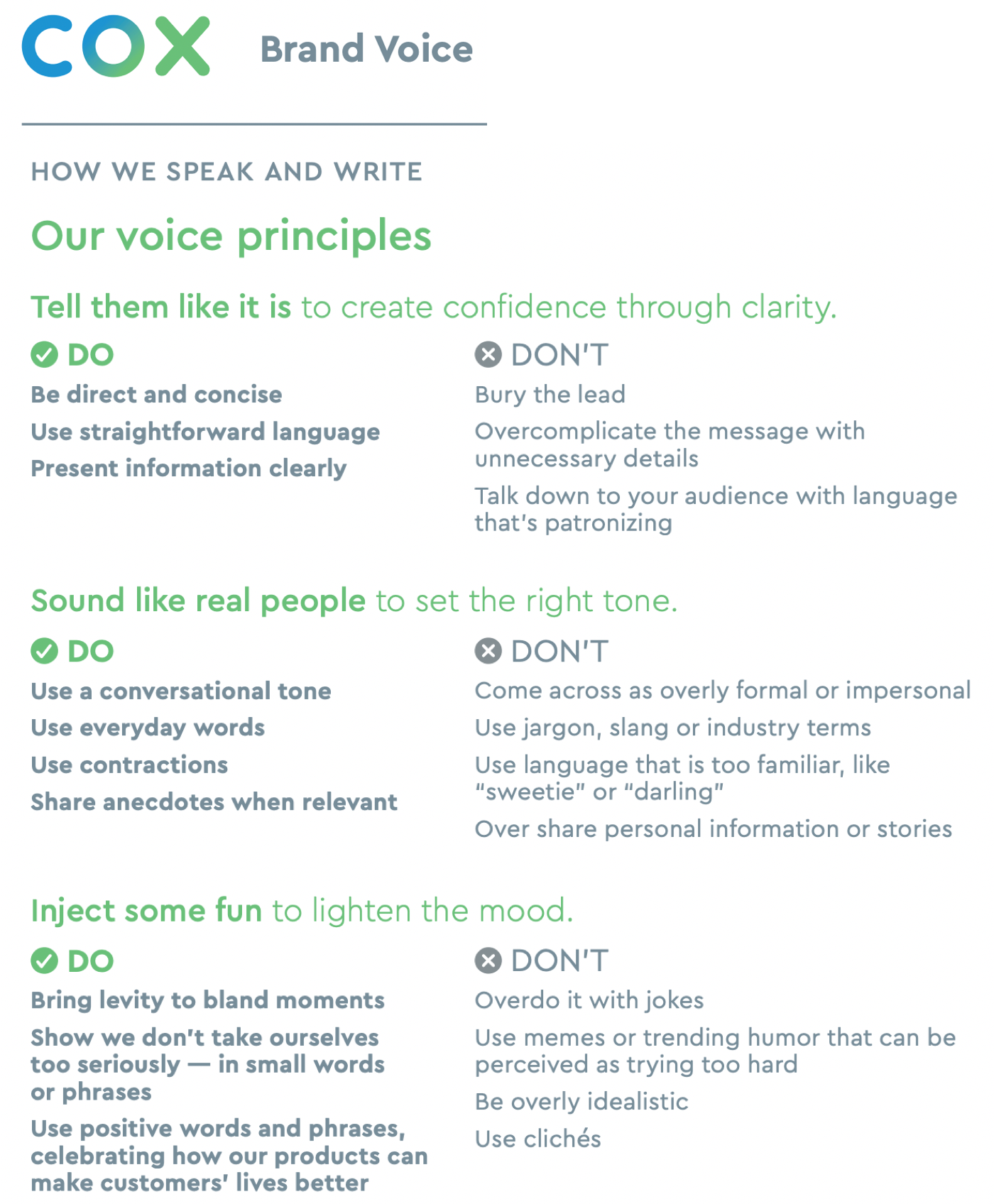
CLIENT’S BRAND VOICE
My team and I first met with our client to better understand their brand voice and style guide.
Cox offers technology products to customers, like smart TVs, Wi-Fi and mobile plans, and smart home devices. But understanding their products and services may get overwhelming for people who are not as tech-savvy.
So, our client wanted our copy to be concise, sound human and feel easygoing to ease the customer's experience on their website to encourage sales conversion.
TEAM COLLABORATION
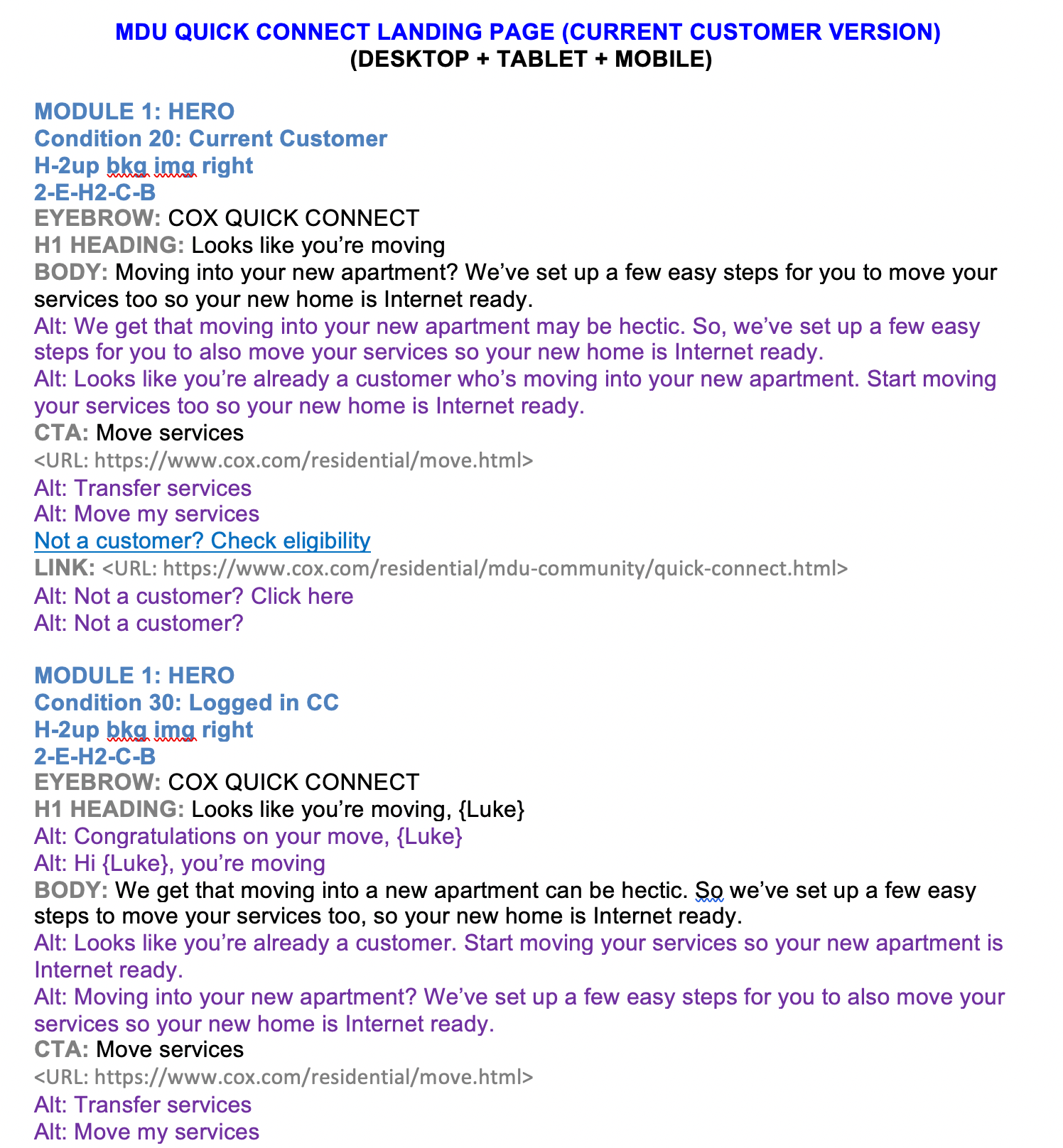
I directly created, reviewed and delivered copy decks (view example, left) where I always referred to Cox’s brand voice and style guide, in order to generate B2C copy.
Following FCB Chicago’s copy deck formatting, I organized where the eyebrow, headline, body and CTA copy (view bolded text in grey, left) are for each website page’s section.
This helped my UX designer and web developer colleagues to easily build out the page online with my recommended copy, and I reviewed the mockups with our client’s feedback.
Besides the final copy recommendations, I always provided alternative copy options (view text in purple, left) so that our client can compare and understand my writing perspective.
The results.
CONCISE COPY,
MORE WARMTH
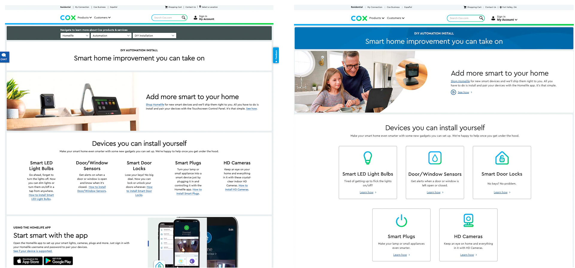
Originally Cox's website content had long copy and did not feel approachable, by only showing the products and not images of people interacting with them. As this strayed from the brand's voice (above), I collaborated with my team's UX designers to recommend strategies to improve our client's website and messaging delivery.
BEFORE
When a customer wants to set up their new smart home, the last thing they want to see is too much copy instructional copy to read (below).
The page’s original version also lacked a human connection as it didn’t show people engaging with the devices, and it felt like a serious corporate marketing page.
AFTER
In the "Devices you can install yourself" section, I recommended creating interactive cards with product icons to encourage the customer to click whichever applied to them.
I rewrote each card's copy to be more succinct and conversational. Each includes a "Learn more" text link to showcase a more uniform experience too.
Along with incorporating Cox's brand colors (blue/green), these updates improved the page's UX by looking more scannable.
AFTER
- It’s Nice That
- AIGA
- Fonts In Use
- The Dieline
?
- email@domain.com
BE EMPATHETIC
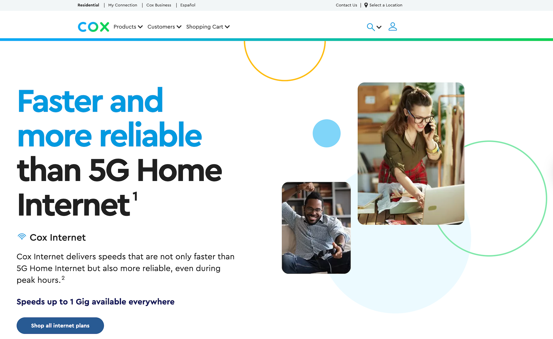
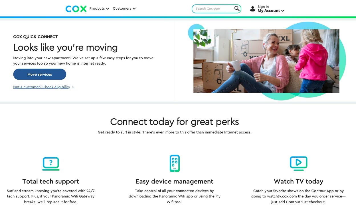
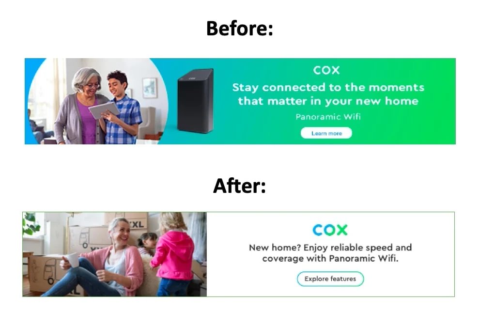
When a customer moves to a new apartment and needs to transfer their Cox Wi-Fi services there, it's understandably hectic.
I rewrote empathetic copy (below), by directly addressing the customer ("Looks like you're moving") with a clear CTA ("Move services"), and a reminder of benefits they can expect while using Cox's services. I also collaborated with my team's UX designer to select an accompanying photo of a smiling family with packed boxes (below, right) to further lighten the mood.
This empowers the customer to immediately accomplish what they need to do, without adding more stress to their move.
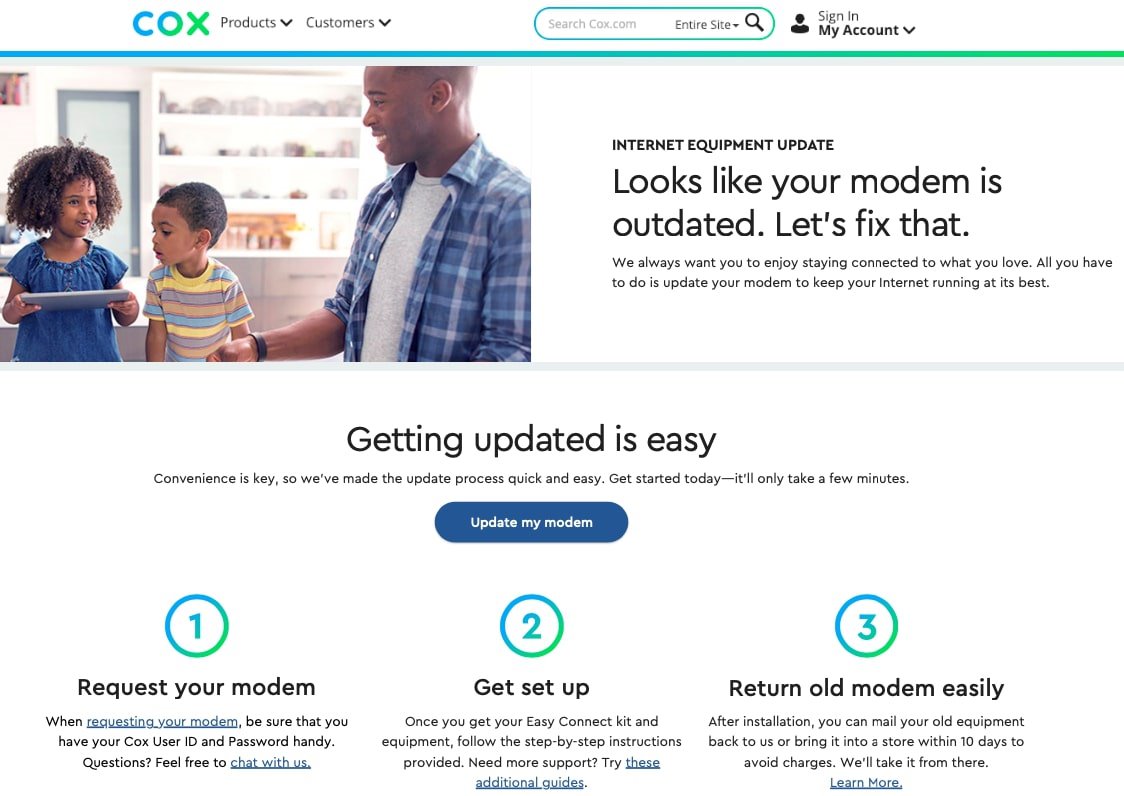
ANTICIPATE USER NEEDS
Customers may find it stressful when a product/service doesn't work normally anymore. When writing copy for a product, it was always important to consider having content that helps customers troubleshoot too.
For example, I reassured customers by writing copy (below) that easily guides them to a solution. By first stating the customer's issue in the eyebrow/headline copy, I employed a conversational tone ("Let's fix that") to sound human and broke the troubleshooting process into 3 easy steps.
With a clear CTA ("Update my modem") and helpful in-text links, customers are more likely to find Cox reliable and strengthens the customer-brand relationship.
EMAIL BANNERS
New customers who signed up for Cox's Wi-Fi service would see this banner (right) in their "Welcome" email.
BEFORE:
While the headline copy sounded positive, it offered vague information by not informing customers what they should expect or act on.
The CTA copy ("Learn more") sounded generic and not action-oriented.
AFTER:
I rewrote the headline copy to directly remind customers of their benefits when signing up for their new Cox Wi-Fi service, to also subtly thank them.
Changing the CTA copy to "Explore features", I wanted the customer to get excited with their new service and encourage their curiosity to discover what else the service offers.
The takeaway.
CONCLUSION
I learned that while a client is understandably excited about advertising their products/services, they don’t always know how to best achieve that.
Through my work, I successfully executed with concise copy, streamlined messaging, adherence to my client’s brand voice guidelines, and incorporating a more approachable personality with their content. My close collaboration with my team’s UX designers and web developers also brought my copy to life, when they mocked up and launched the rewritten pages.
To help customers make the most out of Cox’s products/services, I always advocated for the end user’s experience and kept their pain points in mind, when writing empathetic copy and making the UX smoother. This makes it more likely to increase sales and foster a stronger customer-brand relationship.