— PROJECT NAME
Handshake
— ROLE
UX research
Rewrite UI copy
Set voice/tone guidelines
Update UX design
— DATE
Summer – Fall 2019
As part of my UX Writing Fundamentals course with UX Writers Collective, I improved a fictional app called Handshake with user-friendly copy and follow uniform voice/tone guidelines.
Handshake is an app used by both freelancers and employers (business owners). Freelancers use it to bill business owners and track their hours on a paid project. Business owners use it to pay freelancers and track their progress (paying and tracking).
CHALLENGE: The Handshake app lacks clear information hierarchy and has confusing copy with no content style guide.
RESEARCH
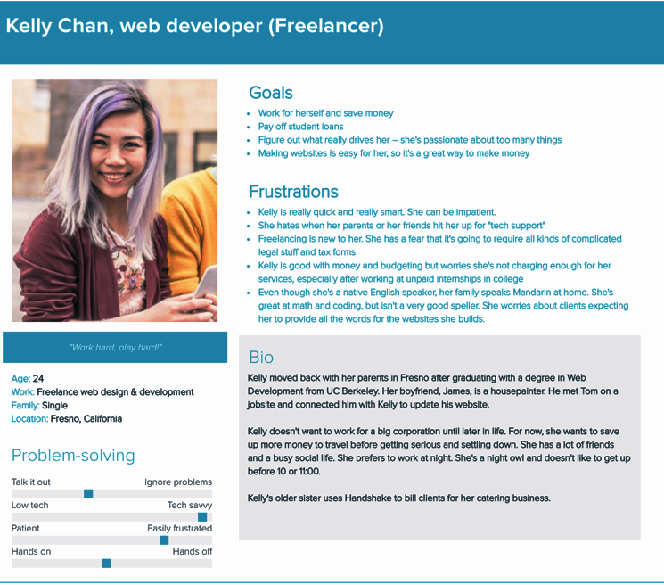
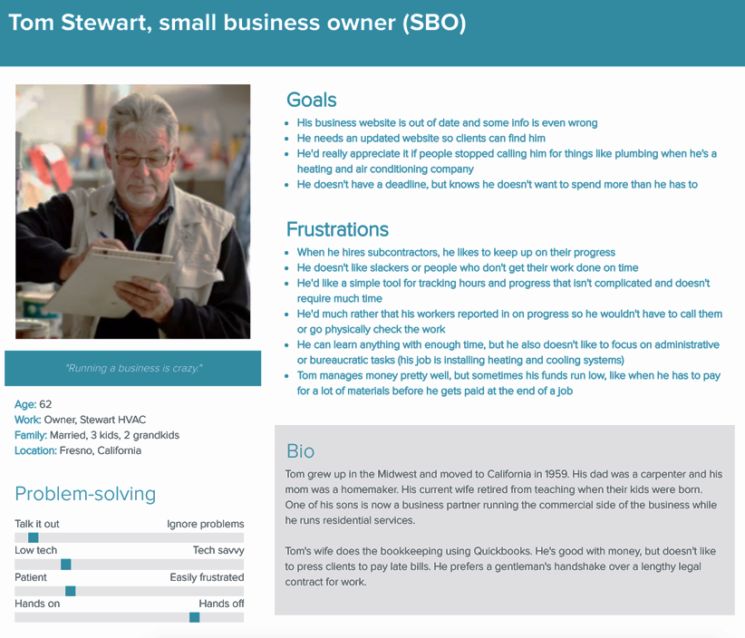
I was given two user personas (below). One is a young adult woman who does freelance web design; the other is a male business owner in his early 60s who is not confident with technology.
RESEARCH
I conducted competitive analysis and noted how several real-life competitor apps (like Upwork, Skrill and Fiverr) wrote their UI copy to their users.
I also used Google Trends to research what keywords and terms each user type would typically use:
- - Payment — As opposed to deposit or transaction
- - Freelancer — As opposed to 1099 contract worker, contract work, contract-to-hire or independent contractor
- - Connect — As opposed to join, gather or link
- - Project — As opposed to assignment or task
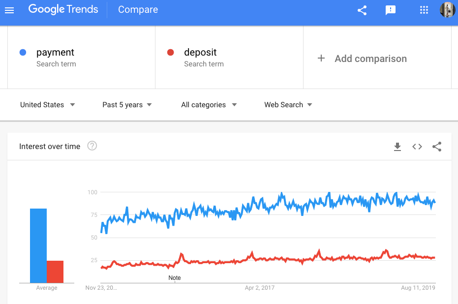
For example, people preferred using the term “payment” over “deposit”.
VOICE GUIDELINES
My research helped me develop Handshake's voice:
Empathetic, not robotic
Acknowledge the user’s progress with encouragement and guidance. Don’t make the experience feel like it’s all just a transaction and nothing more.
Accessible, not exclusionary
Appeal to both user personas, instead of just one. Inclusivity comes with productivity.
Driven, not aggressive
Inspire the user to feel motivated. Instead of making a user feel bad for falling behind, give them the information they need to get back on track.
EDITING UX COPY
The project’s instructions, user personas and my research influenced how I edited the initially-provided UI copy to make Handshake a more user-friendly app.
The following are some examples of the screens I rewrote and as labeled, certain screens are for a user who is an employer while other screens are for a user who is a freelancer.
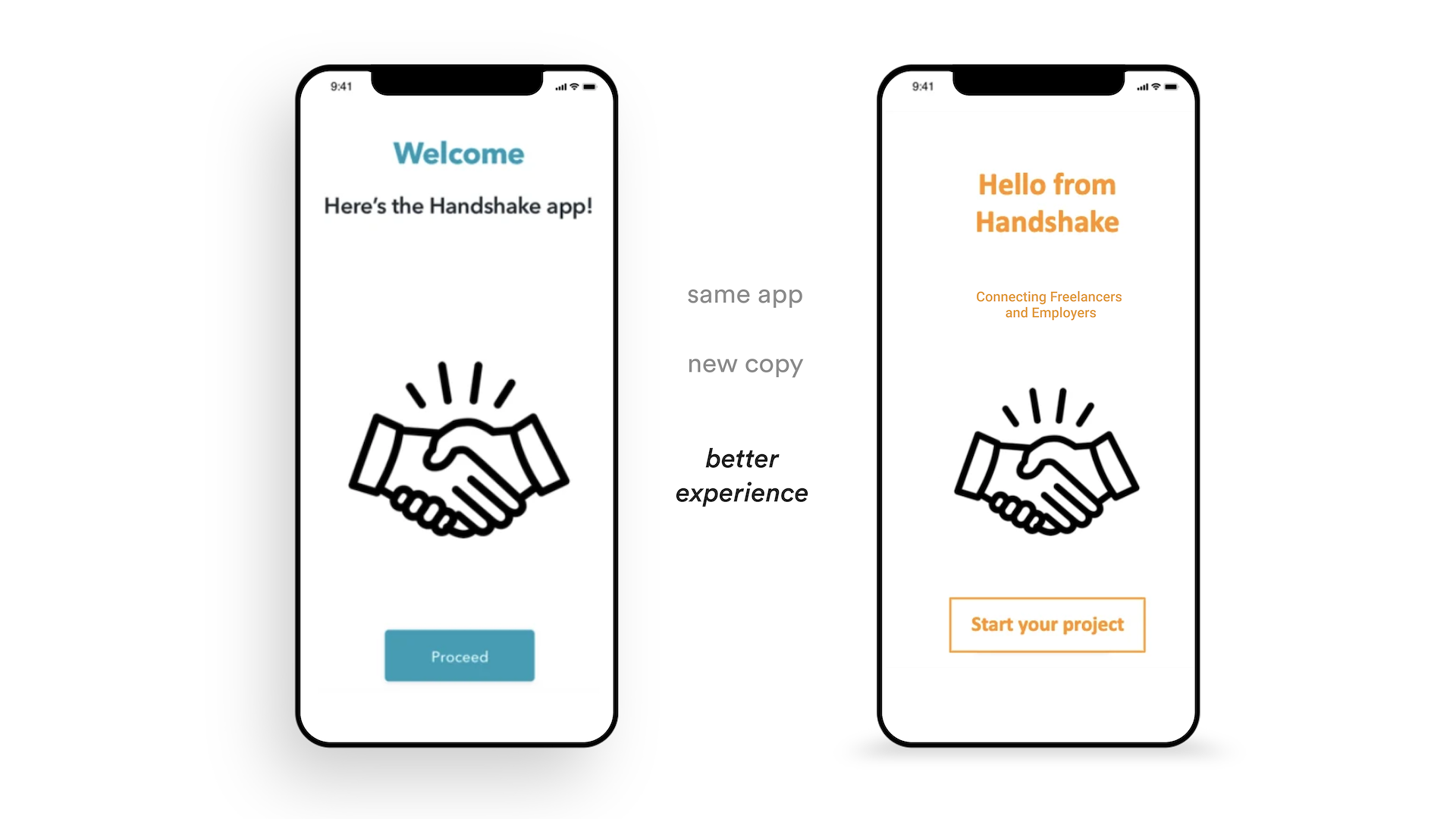
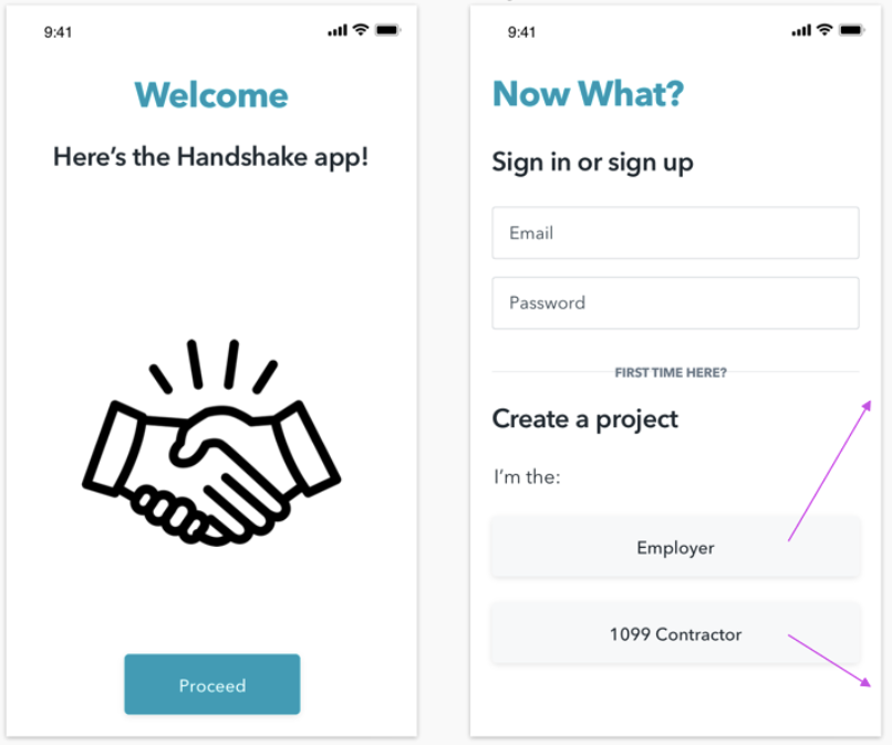
Welcome screens – Before
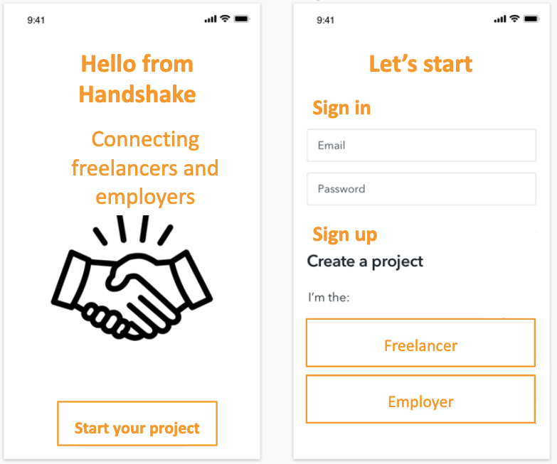
Welcome screens – After
Edits:
- - Concisely explained what user types Handshake serves
- - Changed CTA to directly address the user in a motivational and encouraging tone
- - Made copy sound more uniform and clear
- - Removed unnecessary exclamation and question marks
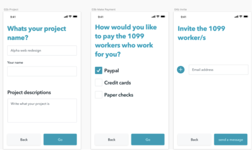
Employer setup – Before
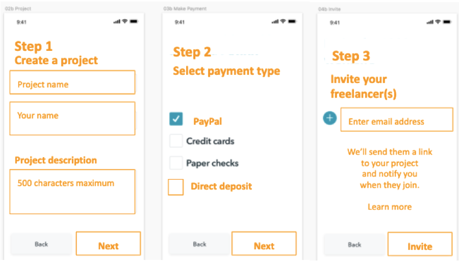
Employer setup – After
Edits:
- Fixed spelling, capitalization and grammar errors
- Used helpful hints in blank fields
- Used numbered steps
- Made the copy sound sharper with action verbs
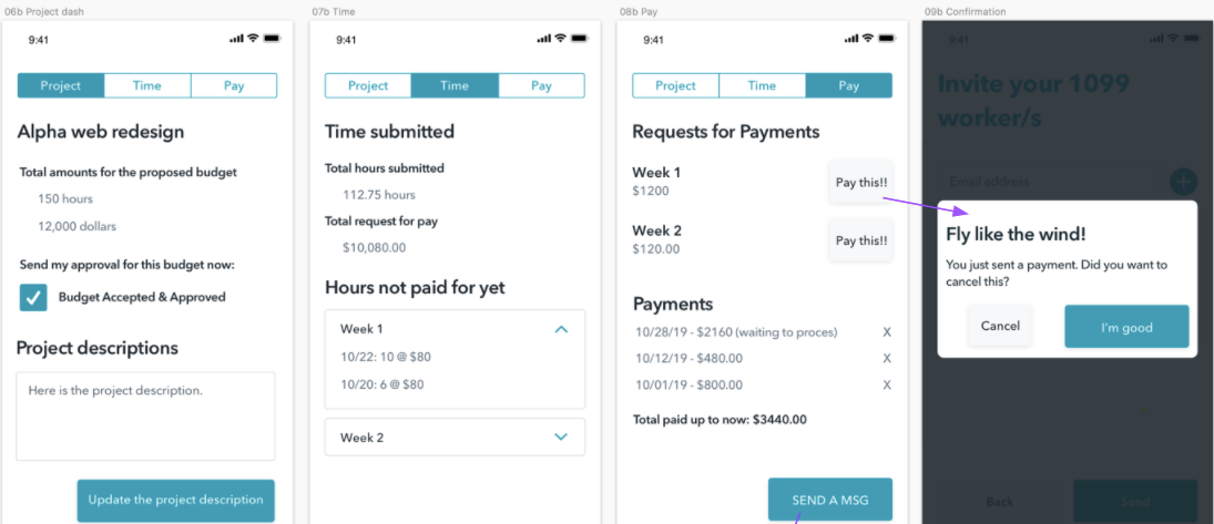
Employer ongoing use – Before
Employer ongoing use – After
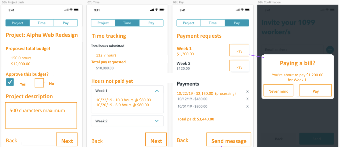
Edits:
- Made more concise CTA copy
- Ensured the format for dates, hours and monetary amounts stayed uniform
CONCLUSION
Conducting UX research like competitor analysis, tracking industry trends/keywords, determining the product’s voice guidelines are critical in informing the UX writing process. Research helped me determine how to best rewrite the app’s copy for its user types and understand how they could use Handshake.
While this was a fictional app as part of a UX writing course, it offered me valuable insight into how a UX writer works behind the scenes to conduct research and improve copy.